Science1 publisherNot yet confirmed elsewhere2 min readPublished
Housing age and poverty rank childhood lead risk for all 83,388 US census tracts
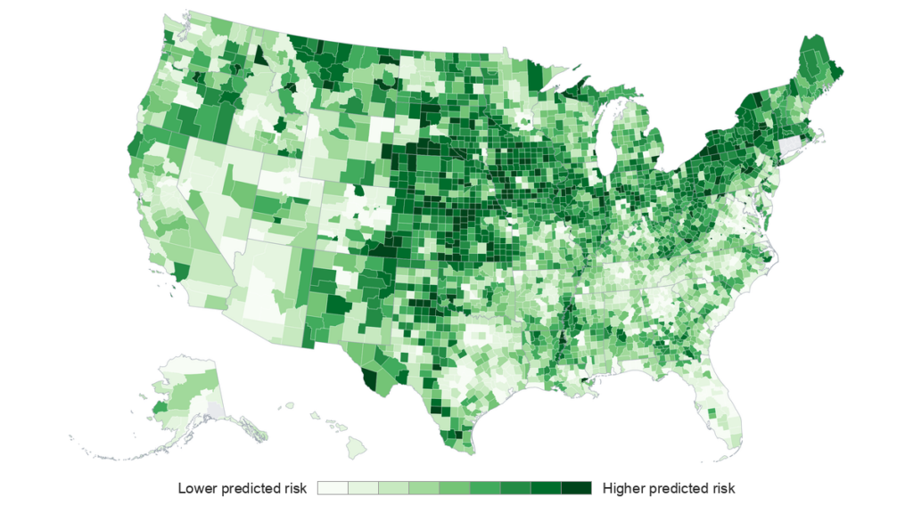
Ritter, founder of lead-testing firm Fluoro-Spec, has scored childhood lead risk for all 83,388 US census tracts from housing age and poverty. The map is meant to show health departments where blood testing and home inspections should go first, since neighborhood lead data are sparse.
The Scientist · Science desk
What happened
- The housing-age and poverty method is not new and other public health agencies already use it; Ritter refreshed it with 2018-2022 American Community Survey data and ran it nationwide.
- The scores were checked against children's measured blood lead levels in 11 states, using tract-level data in some states and county-level data in others.
- Michigan and Ohio supplied data already used in the earlier EPA research, so those two states served as consistency checks.
Compiled by The ScientistSomething wrong?How this is made
Why it matters
- decision Health departments can rank every tract by one method when deciding where testing goes first, but the score cannot clear a single house, so home inspections stay necessary wherever it points.
- constraint A Western or Sun Belt department that skips low-scoring tracts on the map's say-so would be relying on predictions that no blood lead data have yet checked.
- cost Because poverty raises a tract's score, the ranking points testing at communities less likely to have their own remediation money, so any cleanup it uncovers will lean on outside funding.
Each tract's score rests on two inputs. Lead paint for home use was banned in 1978, so the share of housing built before then stands in for paint that may still be on the walls, and higher poverty adds risk on top [3]. The EPA research behind the method suggests both predict childhood lead exposure [2]. Ritter published the national version in GeoHealth in 2026 [13].
Michigan and Ohio aside, nine states tested the score independently [15]. In all 11, higher predicted risk went with higher measured blood lead in children [9]. If the tract-level correlations are ordinary Pearson coefficients, squaring them puts the variation shared between score and blood lead at roughly 18 percent in Minnesota and 41 percent in Wisconsin [16]. For a score built from two inputs, those are respectable figures. In Minnesota, about four-fifths of the variation still sits outside the score [16].
The county results run higher, from 0.48 in New York to 0.77 in New Jersey [11]. A county is a coarse unit. The average US county holds about 26 tracts [14]. A strong county correlation says the score finds a state's worse counties. It says less about which of those 26-odd neighborhoods a testing team should visit first.
The thing a correlation doesn't tell a health department is how the top of the list performs. A team with a fixed number of testing days needs to know what share of children with elevated blood lead live in the highest-scoring tracts, because those are the tracts it can reach. The Eos summary of the paper reports only correlations.
Geography is the larger gap. All 11 validation states have older housing and sit in the Northeast, Midwest and Great Plains, so the map's low-risk predictions for the West and Sun Belt have not been tested [7]. The score sees only housing age and poverty [2]. An exposure route that follows neither would not raise a tract's score in any region.
Ritter founded the lead testing company Fluoro-Spec [1]. The paper presents the map as a neighborhood screening tool [12], and I think the evidence supports that use in the 11 states where it was checked [6].
What to watch
- A comparison of the scores with blood lead records from a Western or Sun Belt state, where the map's low-risk predictions remain untested.
- Whether the full GeoHealth paper reports what share of children with elevated blood lead live in the top-scoring tracts.
- Uptake of the national tract scores by health agencies outside the 11 validation states.
Clarity's read
What the record supports and how the coverage leans. The claims behind it follow.
Reality
- Evidence55
- Adoption
- Insufficient
- Hype gap+10
- Incentives45
- Confidence55
Claim ledger
Ranked by verification strength, evidence, and original report placement.
- [1]
Ritter, founder of the lead testing company Fluoro-Spec, computed a lead exposure risk score covering all 83,388 U.S. census tracts and 3,222 counties.
ReportedSupportedSource: Eos research spotlight (Rebecca Owen) on Ritter's GeoHealth paperView cited source - [2]
The score works from EPA research suggesting that a community's housing stock age and poverty level are predictors of childhood lead exposure.
- [3]
The sale of lead paint for home use was banned in 1978, so neighborhoods built before then, and neighborhoods with higher poverty rates, face greater lead exposure risk; lower-income communities are also less likely to have funds for lead remediation.
- [4]
The metric is not novel and has been adopted by other public health agencies; the author updated it with 2018-2022 American Community Survey data and applied it across the entire country.
- [5]
Data on lead exposure are sparse at the neighborhood level in the United States.
- [6]
The author validated the score against children's measured blood lead levels in 11 states (Illinois, Iowa, Massachusetts, Michigan, Minnesota, Missouri, New Jersey, New York, Ohio, Rhode Island, Wisconsin), with some data at census tract level and some at county level.
- [7]
All 11 validation states are older-housing states in the Northeast, Midwest and Great Plains, so the map's low-risk predictions for the West and Sun Belt have not been tested.
- [8]
Michigan and Ohio served as consistency checks because their data came from the earlier EPA research.
- [9]
The results showed a consistent positive relationship between predicted risk and measured blood lead levels across all states tested.
- [10]
Among states with tract-level data, Wisconsin had the strongest correlation (0.64) and Minnesota the weakest (0.43).
- [11]
Among states with county-level data, New Jersey had the strongest correlation (0.77) and New York the lowest (0.48).
- [12]
The map cannot tell a family whether their home is safe from lead; the author says it can be useful as a screening tool to identify neighborhoods where exposure may be more likely and to guide where blood testing, home inspections and outreach might be done.
- [13]
The study was published in GeoHealth in 2026.
- [14]
The average US county contains about 26 census tracts.
- [15]
Nine of the 11 validation states provided an independent test of the score.
- [16]
If the tract-level correlations are Pearson coefficients, the score shares about 18% (Minnesota) to 41% (Wisconsin) of the variation in measured blood lead, leaving about 82% unexplained in Minnesota.
Sources
1 independent publisher whose own reporting we read for this story.
- eos.orgMapping Childhood Lead Exposure Risk in the United States, Neighborhood by Neighborhood
1 article · October 8, 2026
Topics and entities
Follow any of these and your For You feed starts watching them — no settings page required.