Science1 publisher2 min readPublished
Portland's worst environmental and health burdens often fall outside 1930s redlined zones
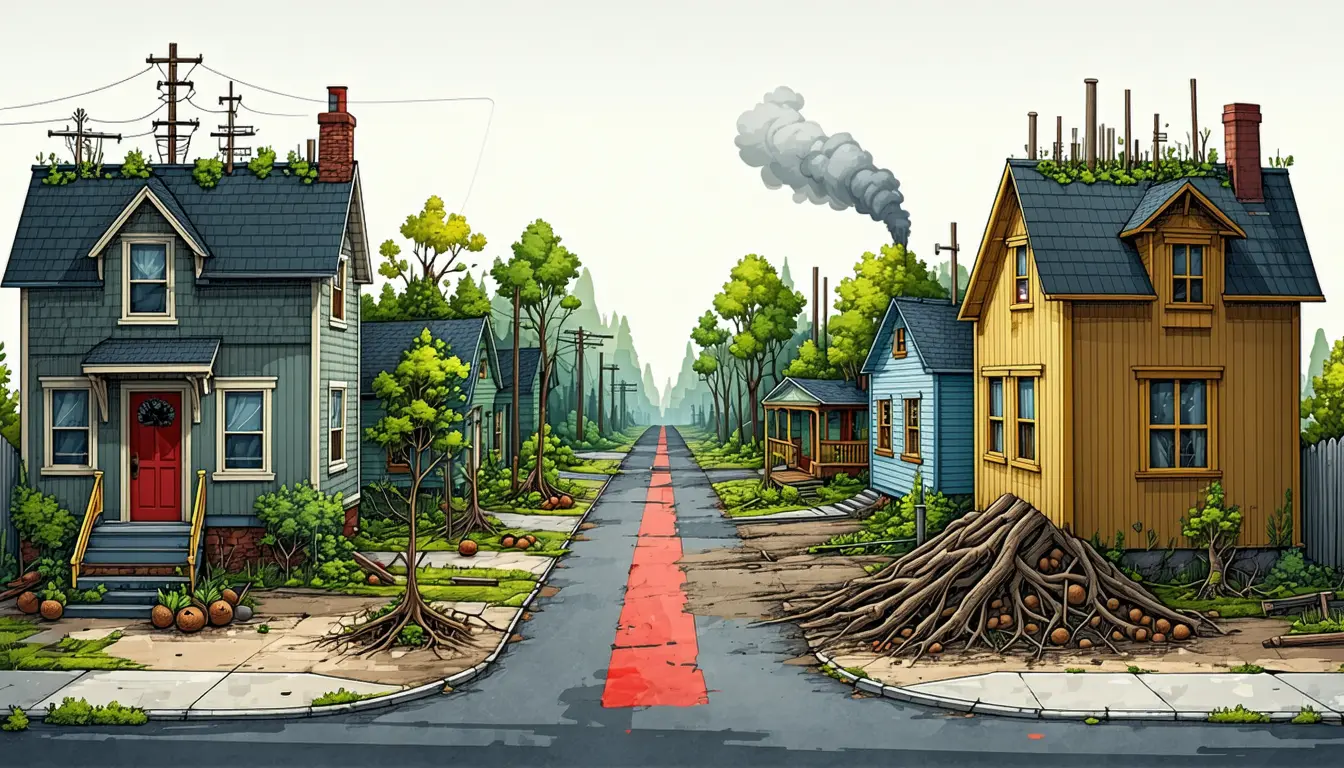
Researchers scoring Portland on more than 100 environmental and health indicators found its worst-off neighborhoods often lie outside 1930s redlined zones. Tree planting or health spending steered only by the old HOLC lines would pass over those places.
The Scientist · Science desk
What happened
- In 1935 the Federal Home Loan Bank Board had the Home Owners' Loan Corporation color-code city neighborhoods, with red marking the highest risk for mortgage lending.
- Co-leads Jola Ajibade of Emory and Kevan B. Moffett of WSU Vancouver compared public socioeconomic data and over 100 environmental and health indicators against the old HOLC borders.
- In the Portland area, poorer neighborhoods often outside former HOLC zones had the worst conditions, including more pollution, greater disaster risk, and more diabetes and disability.
- Once-redlined areas that have gentrified gained transit and community resources but have hotter streets, less tree cover and more pollution.
- Areas where displaced families have moved are greener and less polluted but lack health care, good schools and transit.
Compiled by The ScientistSomething wrong?How this is made
Why it matters
- exposure In gentrified, once-redlined neighborhoods, heat and pollution land hardest on longtime residents, because newcomers with more money can offset some of the health risk and they often cannot.
- decision Where displaced families have landed, the gap is clinics, schools and transit, so greening money sent there would address a deficit those areas mostly do not have.
- constraint Air-quality work aimed only at poorer neighborhoods would miss the high pollution the study found in affluent parts of Portland's city core.
Part of the pattern outside the old zones comes from where the 1930s maps were drawn. The neighborhoods HOLC colored red tended to be in the older parts of city centers [1][2]. "When we keep focusing on redlining, we miss the fact that most cities in the United States have grown far beyond their original city centers," said Jola Ajibade, an associate professor of environmental sciences at Emory University and a co-lead author [2][4]. A neighborhood that grew up beyond the graded area has no HOLC color at all. A program keyed to the red lines cannot reach it, however poor it becomes.
The team's groupings do not line up as a simple ranking from best to worst. According to the phys.org report, affluent, predominantly white neighborhoods had cleaner environments, more trees, better health care access and lower disaster risk, whether or not they were historically redlined [6]. The ones in the city core also had high levels of air pollution [7].
The report does not say how many neighborhoods fell into each group, what geographic unit the team used, or how large the gaps in diabetes, obesity or disability rates were. Without those figures, the report does not let a reader estimate how much of Portland's disadvantage a redlining-based program would miss. The paper's title says gentrification, displacement, disadvantage and exclusivity "predict" urban environmental and health inequities [13]. As the report describes it, the analysis compares present-day conditions across present-day and 1930s boundaries [5]. That shows where burdens coincide. On its own, it does not show that gentrification made streets hotter, or that moving to an area that takes in displaced families harmed anyone's health. The work also covers a single metro area, Portland, Oregon [3].
"To build healthier, more equitable cities, policymakers and planners must look beyond the narrow lens of redlining," Ajibade said [3]. She added that the approach can show "how policies and investments in efforts such as tree planting, improving housing, health interventions and disaster-risk reduction can make the biggest difference" [4].
What to watch
- A rerun of the method in a US metro that grew differently from Portland, to test whether the same neighborhood groups appear.
- Longitudinal data following the same Portland neighborhoods or displaced families, the design that could test whether gentrification and displacement cause the health gaps.
- Whether Portland-area agencies use the groupings to place tree planting, housing or disaster-risk spending.