Science1 distinct publisher3 min readPublished
Two polar scientists agree the Aug. 29 satellite image is striking, but they disagree about what it proves. That gap matters: a single frame near the pole reflects a few days of weather, while the real trend lives in ice thickness.
The Scientist · Science desk

Compiled by The ScientistSomething wrong?How this is made
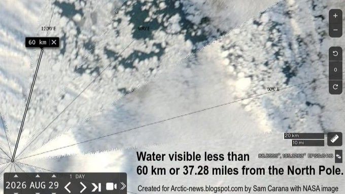
The useful quantity here is not the distance but the timescale. Zachary Labe of Climate Central told Live Science that individual satellite images from around the North Pole in just the last two weeks show dramatic changes in the amount and location of visible open water [8]. A frame dated Aug. 29 is, on that account, a measurement of where the floes were on Aug. 29. It reached the public through NASA's Worldview browsing tool and the blog Arctic News [2], which is an ordinary way for a picture to travel and a poor way for a time series to travel.
Precedent sits close at hand. Julienne Stroeve, a professor of polar observation and modeling at University College London, called the patches quite striking while noting this is not the first time water has encroached on the ice this way [3]; she pointed to early September 2016, when the central Arctic Ocean and the regions north of 80 degrees north were highly fragmented [5]. Labe adds that there is no specific distance from the pole at which open water should normally stop, because Arctic conditions vary substantially from year to year [11]. So the geometry is worth stating plainly: 60 kilometres is a little over half a degree of latitude, which puts that water near 89.5 degrees north [19], close to the pole but not close to any distance that scientists treat as a threshold.
The counterintuitive part is what a diffuse pack does to the number most people quote. Stroeve's warning is that winds could compress the ice into a more compact cover and produce a sudden drop in total extent [10]. Spread-out ice can hold an extent figure up. What extent does not measure is how thick or how old that ice is, and thickness is where both scientists locate the change: summer ice has become thinner and more fragile in recent years, so open water consistently reaches closer to the pole than it used to [12], and some of the northernmost regions that historically ended summer with expansive, persistent ice now carry young, brittle floes instead [15].
That is also why the two experts can hold apparently opposed positions without either being wrong. Stroeve does not think open water at the pole has ever been this extensive [4]; Labe does not read the image as showing conditions dramatically worse than other recent years [13]. One is a statement about a visible pattern on one day, the other about the ranking of a season, and only the second requires a denominator. The claim that does the real work in the background is the rate: the Arctic is warming nearly four times faster than the global average [14].
A single image can tell you something about the character of the ice pack, but it can't settle the question of how the season ranks.
Ranked by verification strength, evidence, and original report placement.
Large patches of open water were visible 37 miles (60 kilometers) from the North Pole on Aug. 29, according to a NASA satellite image.
The image came from the NASA Worldview satellite photo browsing tool and was shared last week on the blog Arctic News.
The central Arctic Ocean and regions north of 80 degrees north latitude were highly fragmented in early September 2016.
Zachary Labe, a climate scientist at Climate Central, said that by the end of summer the sea ice generally becomes more fragmented, with areas of open water appearing more widespread between pieces of sea ice.
Labe said local weather and ocean currents can create large gaps between ice floes, and that strong winds can push fragments together or pull them apart, widening or closing areas of water within hours or days.
Labe: 'Individual satellite images from around the North Pole in just the last two weeks show dramatic changes in the amount and location of visible open water.'
Distinct publishers with included, body-backed reporting in this cluster.
Follow any of these and your For You feed starts watching them — no settings page required.
science
The ocean's hottest day on record landed in August, and that is the number that matters3 distinct publishers
science
Astronaut constipation gets a blood marker, and a Mars-length problem attached1 distinct publisher
science
Three Pacific cyclones spinning at once match what the spring El Niño outlook called1 distinct publisher
product
A five-watt nuclear heater on Blue Ghost turns lunar night into a procurement problem1 distinct publisher
Evidence-backed comparisons of source perspectives and observed adoption signals. Read the methodology
Which Builder, Operator, and Investor concerns the observed source mix emphasized—not a truth score.
Evidence, demonstrated adoption, hype gap, incentives, and confidence are assessed independently, each on its own current evidence. How these are measured.
One frame, two emailed scientists, no numbers
Everything rests on a single Aug. 29 satellite image that Live Science did not obtain from NASA directly but from a blog repost, plus email comments from Stroeve and Labe. Both scientists are credible and on the record, and both hedge — but the quantities the story leans on go unprinted: no extent value behind 'not particularly low', no thickness or ice-age series behind 'thinner and more fragile', no citation for the four-times-faster warming ratio, no uncertainty on the 37-mile measurement.
No uptake signal available
Nothing in this reporting speaks to whether anyone acted on the image — no other outlet's pickup, no agency statement, no change in an ice forecast or shipping advisory. The Arctic News repost is the only circulation fact on the record, and one blog share is not a measurable trail.
Headline runs ahead of its own experts
The body of the Live Science piece is careful — Labe explicitly says the image does not show conditions dramatically worse than other recent years, and that no distance from the pole is the normal limit. The framing is not: the distance-from-the-pole hook and the borrowed phrase 'worrying snapshot' invite readers to treat a wind-driven few days as this year's verdict. The overstatement lives in presentation rather than in what the scientists said, which is why the gap is modest.
Mild, and mostly disclosed
The chain of attention has a slope to it: a campaign-adjacent blog surfaces the image, one of the two experts works for Climate Central — which Live Science correctly describes as a nonprofit news organisation that analyses and reports on climate — and a distance-from-the-North-Pole headline is worth traffic. None of that is hidden, and the same Climate Central scientist is the one arguing hardest against reading the frame as a bad-year signal, which cuts against the easy reading of his affiliation.
Firm on the frame, soft on the meaning
That open water appeared close to the pole on Aug. 29 is about as solid as a one-source report gets — named imagery, a date, two polar specialists who accept the observation. What it means is far less settled: the trend claims arrive without data, the superlative is hedged, and with only Live Science reporting it there is no second read to test any of it against.