Product1 publisher3 min readPublished
iOS 27.1 nearly doubles the iPhone Duo's screen area when it opens
Apple's foldable ships its own iOS point release, reworked around a 5.4-inch outer screen and a 7.6-inch inner one. That leaves iOS teams owning the layout questions system-level continuity does not answer.
The Product Desk · Product desk
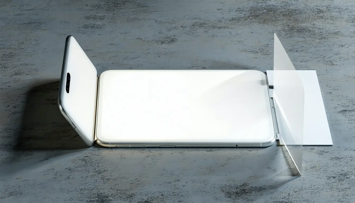
What happened
- The iPhone Duo ships with iOS 27.1 rather than the iOS 27 build on conventional iPhones, with significant parts of the interface reworked around its 5.4-inch outer display and 7.6-inch inner screen.
- Opened, the Home Screen becomes a two-page layout, with Today View and its widgets on the left side of the inner display and app icons on the right.
- Split View brings side-by-side apps to an iPhone, including swapping either app, saving app pairs and running two windows of the same app, which Apple demonstrates with two Safari pages.
- Early hands-on testing observed the interface coming into focus as it moves between the two displays rather than jumping abruptly from one to the other.
- Apple names five configurations for the device, and in the Standing position the outer display runs an upgraded StandBy mode that no longer requires the phone to be plugged into a charger.
Compiled by The Product DeskSomething wrong?How this is made
Why it matters
- constraint A screen drawn once for a portrait phone now has to hold up in a pane with the outer display's area squeezed into half its width, so wide tables, timelines and side-by-side comparisons are where the work concentrates.
- cost No team can size the port from the launch coverage, because the developer-facing rules are absent from it, and the people who pay for that gap are the ones being asked this week for a date.
- decision Saved app pairs make an internal choice visible to users: either the inner display is one bigger phone, or it is two panes where your app will routinely sit next to a competitor's.
- capability Comparison flows and a persistent assistant alongside content have been the standing excuse for shipping something on iPad first, and that excuse no longer holds for a phone in the hand.
Someone is reading a Safari page on the 5.4-inch outer screen, opens the Duo, and the page continues on the 7.6-inch inner one [2]. Apple gave the two displays the same aspect ratio, so content scales proportionally as the phone opens and closes rather than reflowing into a new shape [7]. Constant shape means the area ratio is the square of the diagonal ratio: 7.6 divided by 5.4 is 1.41, and 1.41 squared is 1.98 [17]. The drawing area nearly doubles while the app is still running.
Split View is where that number starts to bite. Halve the inner display and each pane carries roughly 0.99 times the area of the entire outer screen [18], the same room in a column half as wide. A layout that already looks right on the outer display has the pixels it needs for a pane and the wrong proportions to use them.
Apple bought that vertical space by moving its own furniture. The Dock and app navigation sit toward the side of the wide inner display, where a thumb can reach them [5], the Dynamic Island runs vertically along the edge and expands there for Live Activities, and the status bar is condensed into a small circle in a corner [6]. Each of those changes where the system tells an app it may safely draw. The Seated posture adds a fifth case: partly folded on a table, the top half plays video while controls stay below [12], which is a half-height canvas with a job already assigned to it.
What teams tell themselves is that foldable support is a launch-week checkbox, one extra size class in the build settings. What people actually do is open the phone in the middle of a task, then put a second app next to the first one and save the pair [9]. Both of those happen without warning to a layout that was written for one rectangle.
The Digital Trends hands-on is a hands-on, and it says nothing about developer-facing rules: no minimum pane size, no word on whether an existing app gets Split View without changes, nothing on how app pairs are declared [19]. Its author also reports that several of the Duo's ideas were immediately familiar from recent foldables including the Motorola Razr Fold [15], and that the display-continuity trick others are working on already looks good on the Z Fold 8 [16]. The design vocabulary is borrowed. The audience is not: nearly 3 million people watched the launch [1].
So the sort that is available before any Duo reaches a desk. For each of your top screens, ask whether the extra area adds content or only adds margin, and whether the screen still works at half width. Screens that gain content and survive the narrow column need nothing from you. The ones that gain content but collapse when narrowed need a minimum pane width and a defined fallback. Where the extra area turns into margin, the choice is between larger type and a second column, and that is a design call, not an engineering one. The screens that gain only margin and also break when narrowed are rewrites, and the count of those is the schedule. Nobody needs the hardware to produce that number this week.
What to watch
- Whether Apple publishes minimum pane sizes and app pair rules for Split View, which decides how much of this is layout work rather than configuration.
- Whether the vertical Dynamic Island and corner status bar arrive as safe-area geometry existing apps read automatically, or as something each app has to handle.
- Whether StandBy running off charger on the outer display opens to third-party widgets.