Product1 publisher3 min readPublished
Apple builds its first foldable to feel like a regular iPhone in the hand
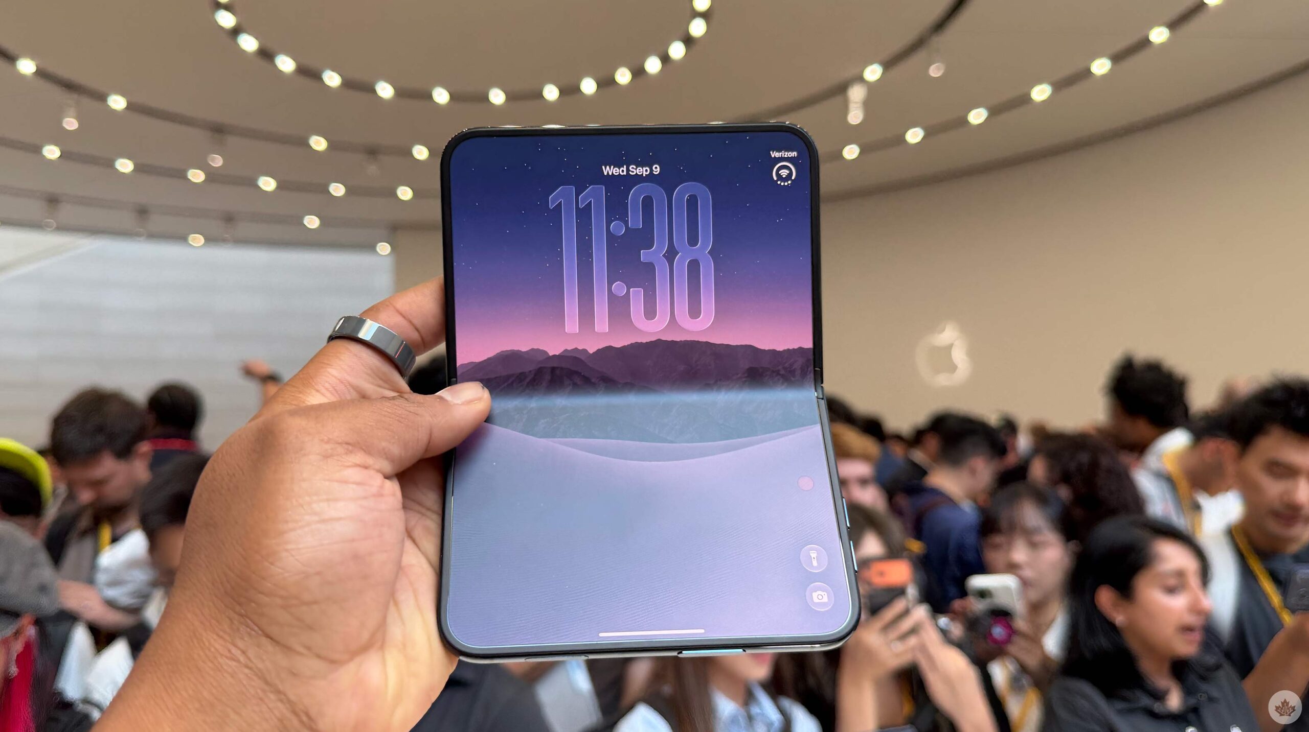
MobileSyrup's hands-on with the iPhone Duo describes a phone thicker folded than its rivals and still familiar to hold, with the interesting decisions sitting in iOS layout rules rather than in the hinge. Review units are not out.
The Product Desk · Product desk
What happened
- MobileSyrup's hands-on reports that Apple's iPhone Duo is considerably thicker when folded than some of the foldable phones already on the market.
- What keeps the folded phone feeling premium, in the reviewer's account, is a titanium frame and hinge cover with Ceramic Shield 2 on the front and Ceramic Shield on the back.
- The nano-texture display is matte and cuts glare, making the crease harder to see at most angles, though the reviewer could still spot it from some and feel it by pressing hard.
- Watching a video vertically with Messages open gives the video its own aspect ratio at the top and Messages the strip below, so the two apps do not get equal halves.
- The two rear cameras are 48MP, an f/1.6 primary and an f/2.2 ultrawide at 120 degrees with 2x zoom from the main sensor, which MobileSyrup notes matches the iPhone 18 Pro Max.
Compiled by The Product DeskSomething wrong?How this is made
Why it matters
- decision Anyone shipping an app onto this phone loses the 50/50 assumption: the operating system sizes the panels from the content, so layouts have to survive a strip whose height the developer does not choose.
- capability The demos that pay off cross app boundaries, so the second panel earns its keep in flows that move data between apps rather than in flows that simply show more of one app.
- constraint A buyer weighing the Duo against this year's Pro Max has no vendor performance number to work from, because Apple's speed claim is benchmarked against the previous generation.
- exposure The inner camera ships with no published spec, only Apple's assurance of parity with the 12MP front camera, which leaves video-call quality resting on the vendor's word until someone shoots with it.
The dock runs along the side of the screen rather than the bottom, so a thumb can find it folded or unfolded, and the Dynamic Island sits in the top right corner and changes with whatever is running, according to MobileSyrup's hands-on [5]. Both of those choices commit to a hand. MobileSyrup's reviewer is right-handed, found the D shape comfortable to hold, and says plainly that he does not know how it will go for left-handed users [13]. For a device sold on feeling familiar, that is the kind of thing that shows up in return rates rather than in reviews.
Familiarity is the actual product claim here. The reviewer's read is that Apple made the Duo feel like an iPhone deliberately, to lower the barrier for someone stepping over from a slab phone [15]. That changes what the buying question is about. The thing being competed with is not another foldable but the phone already in the user's pocket, and the cost being attacked is the cost of relearning where everything lives.
The performance story is still vendor copy. Apple's claims include an advanced thermal system and up to 24 hours of battery life when both displays are in use [9][10], and MobileSyrup could not test any of it, because review units are not yet available [14]. The rear cameras carry the same numbers as the iPhone 18 Pro Max [8], which means that on the spec sheet the rear camera gives a buyer no reason to choose one over the other [1]. Whatever separates the two phones is the panel and the software running on it.
What a first impression cannot supply is the part an operator has to answer for. It measures the first hour: how the hardware sits in the hand at a demo table, how convincing the multitasking demos look when someone else is driving. It does not measure whether the second panel is still being opened in month two, or how far into a session a person gets before folding it and going back to one screen. Nobody has that for any Apple foldable.
The sort worth doing before anyone budgets for this form factor: take the handful of flows your users actually run, and put each one in the pile that gets better with more pixels or the pile that gets better when two things are visible at the same time. Reading and video sit in the first pile, and a large slab already serves them well. Pulling something out of one app and into another, or checking a message without losing your place, sits in the second. Only the second pile pays for a hinge, and it is also the pile where the layout behaviour Apple demoed either holds up in your app or does not.
What to watch
- Review units landing, which is when Apple's 24-hour dual-display battery figure and the A20 Pro thermal claims get tested rather than quoted.
- Whether the inner under-display camera holds up against Apple's stated parity with the 12MP front camera once someone shoots with it.
- Whether left-handed users hit real friction with the D shape, the side dock and a Dynamic Island parked in the top right corner.